DNL WeCare
Style Guide
Welcome to our hub for partner guidelines and assets. We want to make it easy for you to integrate DNL WeCare, while respecting our brand identity.
Our Logos
The DNL We Care logo is the flag of our brand system. We designed the logo to make a statement on its own and work well with our product and partner logos.
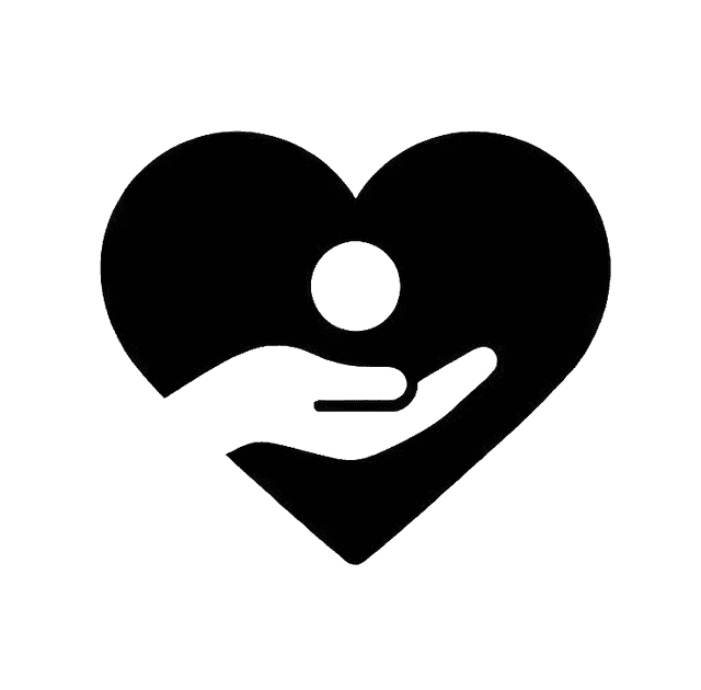
Color Palette
The DNL We Care Design color system can help you stay true to a color theme that reflects our brand and style. We use color in meaningful ways in all expressions of our brand.
Primary
Our primary palette uses bright colors to bring a boldness to our brand and is used in logical ways throughout product and marketing to guide the eye and highlight the important parts. We pepper colorful, lighter, secondary palette colors throughout to soften the experience and impart confidence and optimism.
Navy
Teal
Green
Grey Light
Secondary
Our secondary palette contains a variety of colors to keep things fresh and interesting. We lean on these colors more frequently when brand awareness is high, or on our own properties where we control the surrounding environment. When used in conjunction with our primary palette, these colors makes every moment feel on-brand.
Teal CTA
Orange
Red
Neutrals
Blue 500
Grey 500
Typography
Typography is an important part of a design system that brings consistency across experiences and platforms. Good typography rules help present content clearly and efficiently. Matter is our primary typeface.
Download Matter FontCompassion in Action.
The quick brown fox jumps.
DNL We Care is dedicated to empowering local communities through sustainable resources, immediate aid, and collaborative growth initiatives. We believe in the power of collective action to create lasting change.
Type Weights
Matter Light
Matter Regular
Matter Medium
Matter SemiBold
Matter Bold
Matter Heavy
Alphabet
Aa
Aa Bb Cc Dd Ee Ff Gg Hh Ii Jj Kk Ll Mm Nn Oo Pp Qq Rr Ss Tt Uu Vv Ww Xx Yy Zz
0 1 2 3 4 5 6 7 8 9
Need something specific?
If you need brand assets or design files that aren't listed here, please reach out to our communications team.
Contact Communications